Studio Notam, Brand Design
BRAND
Social Media & Marketing Studio
SCOPE
Brand Identity Design, Business Card Design
CREATIVE DIRECTION
Bold-minimal, airy minimalist
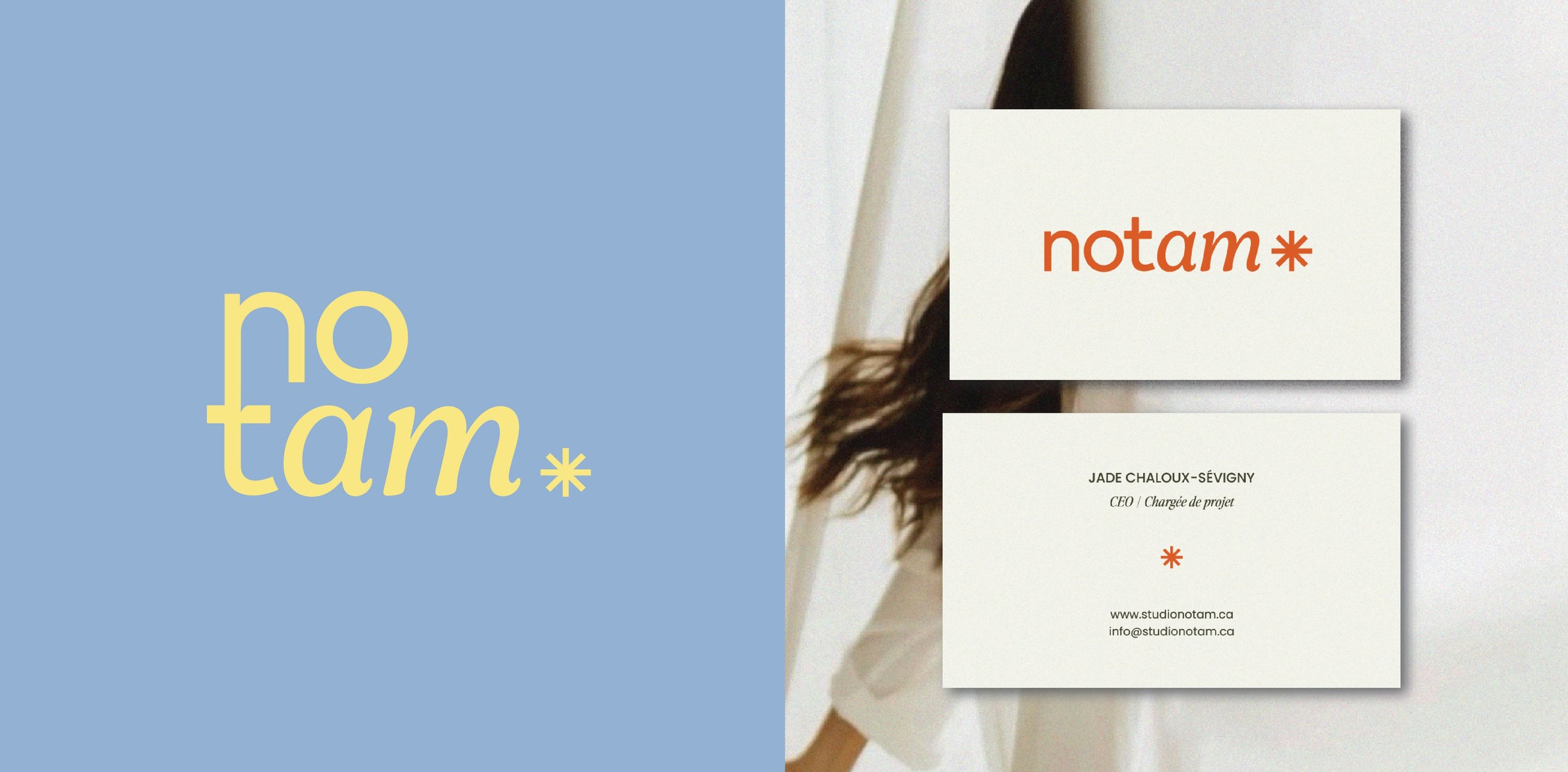
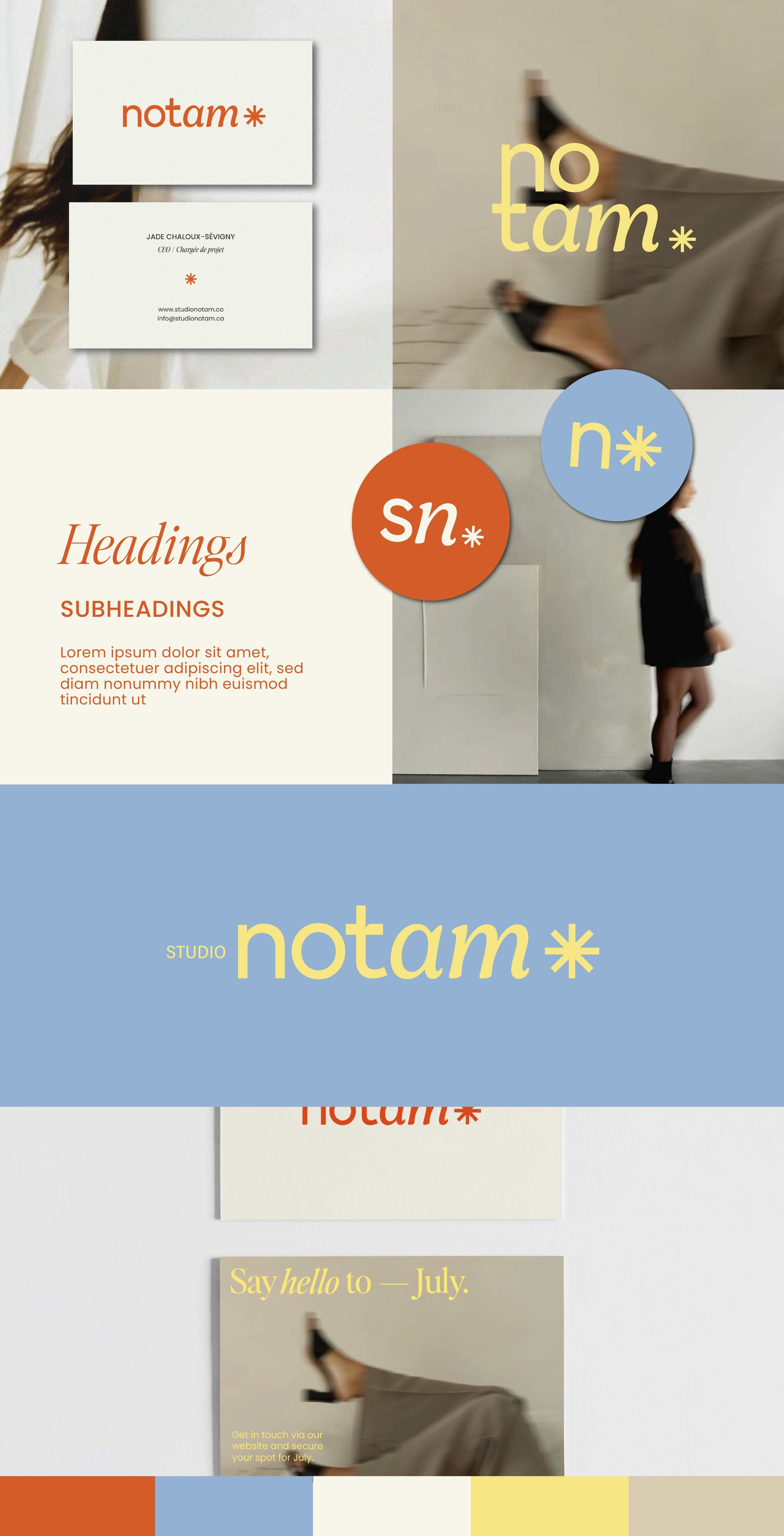
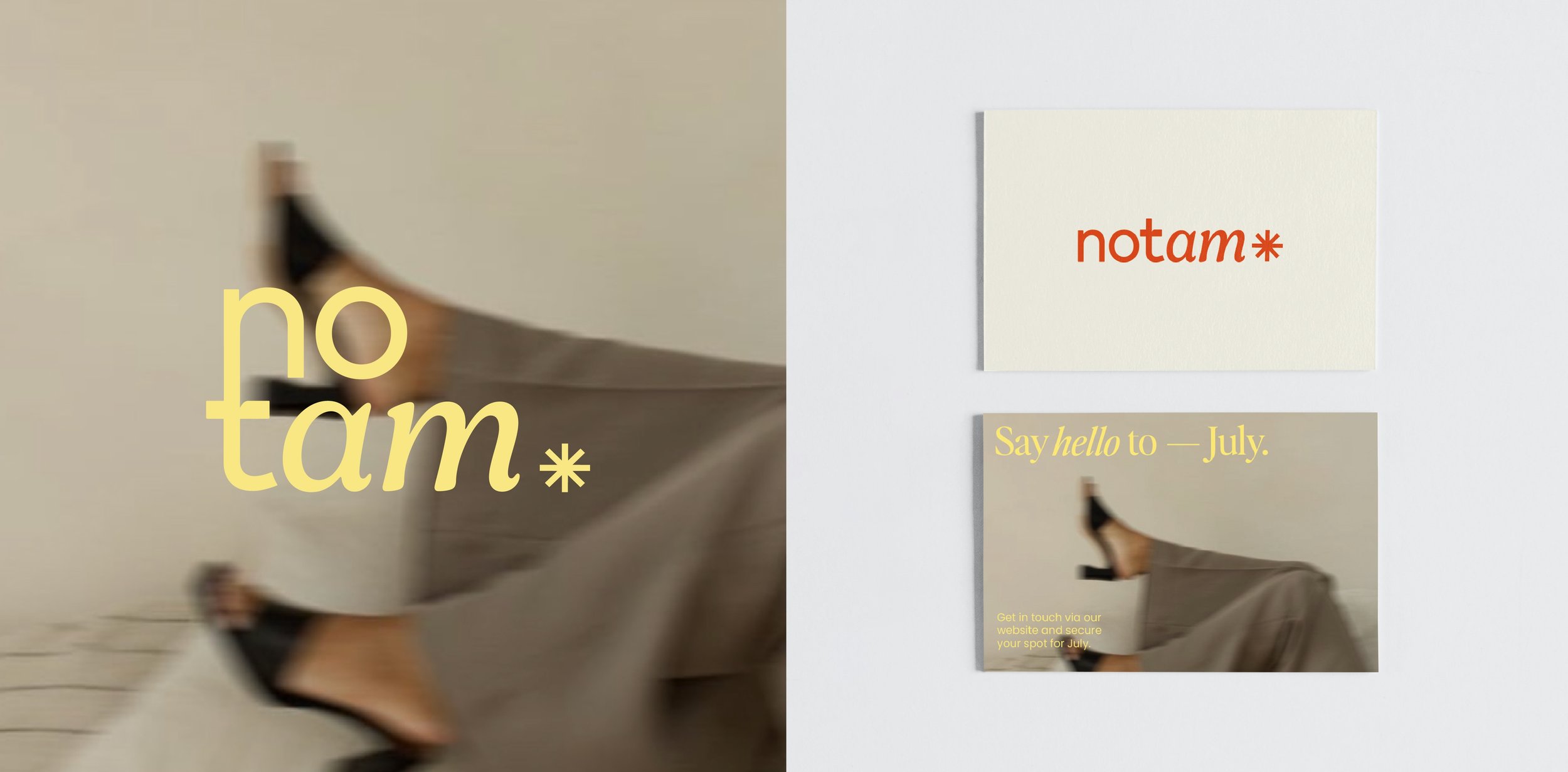
This Canada-based social media studio was looking for a rebrand with a friendly, minimalist, and airy feel, paired with a touch of sophistication and a vibrant color palette.
The wordmark was created by blending and adjusting letters from different fonts. Lowercase letters add approachability, while serif details bring a bit of elegance. The icon was designed in a clean, friendly style by rotating the crossbar of the 't' to connect it to the wordmark. For typography, a refined serif was paired with a classic sans-serif to match the overall look and feel.


